We didn’t lose our inner child. We turned it into ArT Toys and More...with purpose.
😶🌫️ RE-IMAGINE II — Ron English x Clutter Gallery
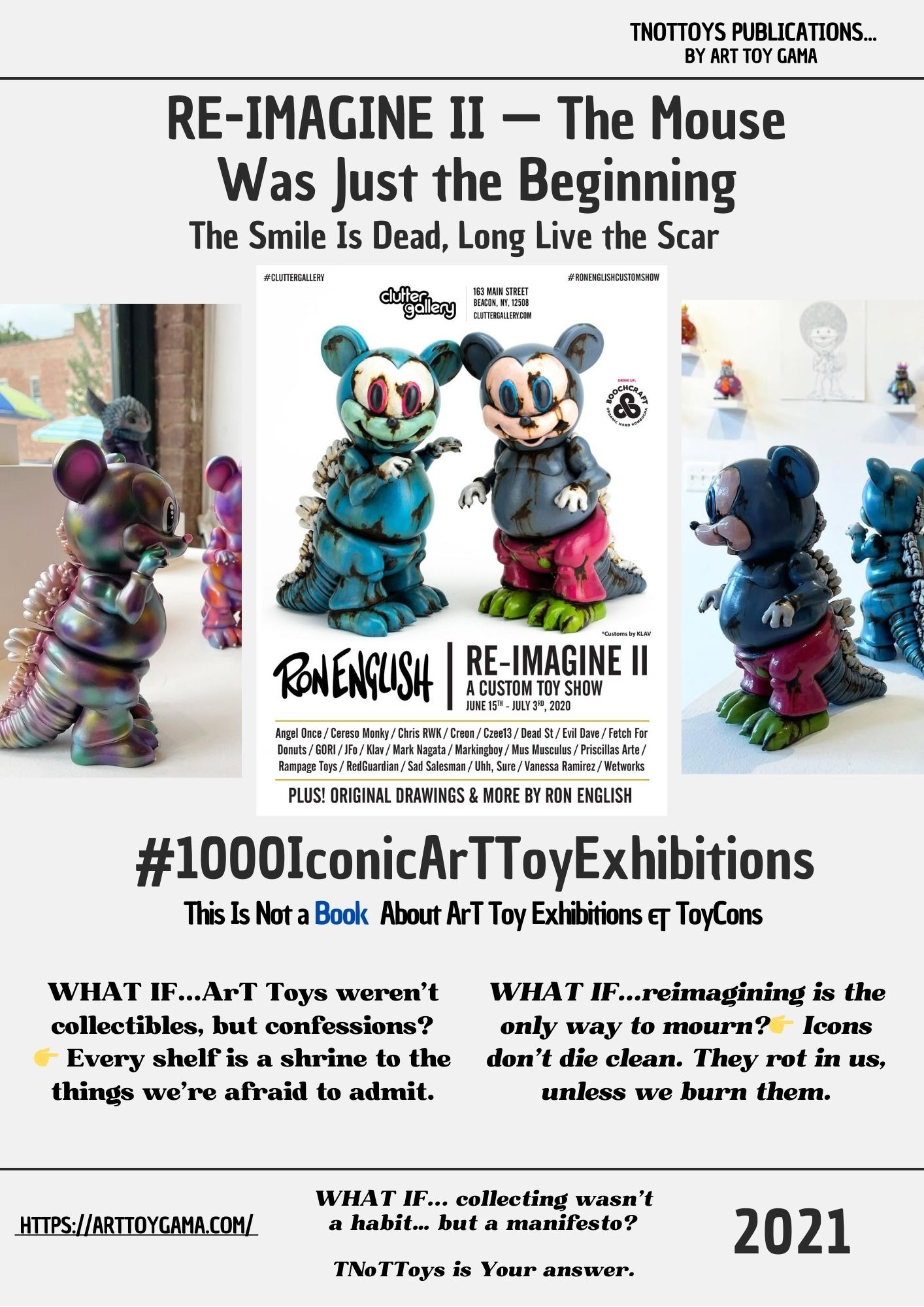
RE-IMAGINE II: When Mickey grew teeth and the smile turned rotten because of Ron English Art ... ( Beacon, New York • 2021 ) #00014 — TNoTToys Publications
1000 ICONIC ART TOY EXHIBITIONSTNOTTOYS PUBLICATIONSTNOTTOYS
Sergio Pampliega Campo & Cristina A. del Chicca
🌀 This post is part of an ongoing research series from Art Toy Gama’s editorial division:
📚 This Is Not a Book About Art Toy Exhibitions & ToyCons
Our Upcoming Art Toy Book: 1000 Iconic ArTToy Exhibitions
Context
The sequel came almost like déjà vu.
Same gallery. Same artist.
But the world had shifted again.
The first RE-IMAGINE cracked open icons in the middle of a pandemic pause.
The second, RE-IMAGINE II, proved it wasn’t a one-time ritual but the beginning of a series:
a calendar of mutations.
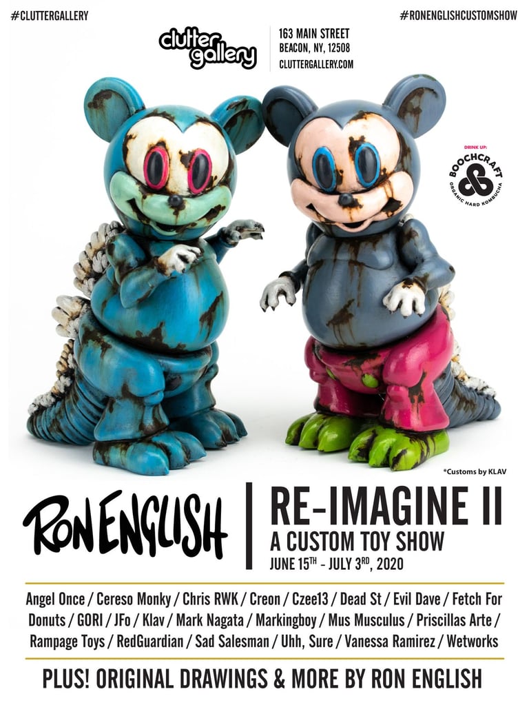
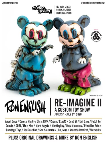
Curiously, the POSTER carried the same date as the first show: June 15 – July 3, 2020.
A typo, a ghost in the design.
But maybe fitting.
Because this sequel was less about linear time and more about repetition,
contamination, and the way pop symbols refuse to die.
POSTER Reading. POSTER Analysis.
What the image really says
Two creatures dominate the POSTER.
Their bodies recall the most famous mouse in history,
but twisted, swollen, decomposed.
Mickey reimagined as monster.
The heads grin with English’s trademark dental menace.
Eyes rimmed in red pulse with chemical unease.
Their torsos bulge, clothes torn, and one even sprouts a reptilian spine;
part cartoon, part dinosaur, part toxic hallucination.
The colors scream in contradiction:
candy pinks, lime greens, aquatic blues.
Shades we’re trained to associate with joy,
turned here into signs of rot.
It’s the language of advertising weaponized against itself,
classic Ron English Popaganda.
Typography seals the intent:
RE-IMAGINE II, bold and declarative.
A sequel, a continuation.
The promise that this act of re-coding culture will not be a one-off, but a ritual.
And the footnote matters too: Original Drawings & More by Ron English.
This Is Not just community hacking;
it’s the master himself feeding the fire.
The POSTER doesn’t illustrate the show.
It contaminates it, right from the start.
✧ The POSTER’s Hidden Architecture
What the Image Is Doing Beneath What It Shows
At first sight, the RE-IMAGINE II POSTER looks simple:
two mutated mascots posed against clean white.
But beneath its surface runs a complex symbolic system,
a blueprint for how pop mythology decays, mutates, and survives.
1. The Icon in a State of Corrosion
These figures aren’t painted;
they’re dissolving.
The dripping textures, the melting edges, the cracked surfaces,
all operate as metaphors for the chemical collapse of pop culture.
Symbolism of the Drip
The blues, greens, and pinks behave like toxic runoff,
as if Mickey were dissolving under acid rain.
English uses the vinyl body to show
how consumer culture corrodes innocence.
The icon isn’t being celebrated,
it’s being dissected.
Exposed Anatomy
The grin is skeletal, metallic, surgical.
A dental X-ray under the world’s happiest mask.
A reminder that the toy is no longer balm,
it is scalpel.
The Shadow Creature
The second figure behind the main one acts as a specter,
an echo of the pop identity being replaced.
The front figure is the critique;
the rear is the memory collapsing.
This isn’t a POSTER .
It’s a pathology report.
2. The Graphic Manifesto of Collective Disobedience
RE-IMAGINE II is not the work of one man,
it is the coordinated act of many.
The Surrender of the Canon
Though Ron English dominates the image,
the POSTER reserves substantial visual real estate
to list the dozens of collaborating artists.
This is not an ego monument,
it’s a communal signature.
The Collective Signature
The artists' names form a wall of authorship,
declaring:
“The icon may come from English,
but the mutation belongs to all of us.”
This is DIY culture elevated into exhibition structure.
Typographic Duel
English’s jagged signature = chaos.
Clutter’s clean sans serif = institution.
A tension that mirrors the show’s thesis:
rebellion framed by structure.
Raw pop vs. gallery order.
The POSTER becomes manifesto.
Not announcement.
3. Mask and Critical Inheritance
The corrupted Mickey is not random;
it is part of a lineage.
The Warhol Bloodline
Warhol stripped products of their “soul” through repetition.
English gives that soul back,
but it’s bruised, cracked, and grinning with bone.
The SmileyGrin is heir to Warhol’s Skulls:
death hiding behind consumer joy.
Mask of Alienation
In 2021, after a year of literal masks,
the forced cheer of pop culture felt oppressive.
English exposes the lie:
positivity can be as suffocating as a skull.
Sarcasm Over Humor
This isn’t parody.
It’s critique.
The creature fuses classical beauty (Mickey silhouette)
with grotesque truth (rotting grin).
It forces the viewer to question
the emotional honesty of iconic imagery.
The POSTER reveals the machinery behind the smile.
And burns it.
✧ Energy Behind the POSTER
The Emotional Voltage Driving RE-IMAGINE II
Where most posters announce,
this one interrogates.
Its energy is not playful.
Not celebratory.
Not promotional.
It is surgical.
Identity
The corrupted mouse becomes an X-ray of cultural Identity.
It asks:
“What is your nostalgia hiding?”
Memory
The shapes recall childhood.
The surfaces recall horror.
Memory glitches.
Childhood redrawn through adult dread.
Rebellion
Everything resists expectation:
· happy mascot → horror relic
· smooth vinyl → cracked fossil
· childhood colors → chemical contamination
The POSTER whispers:
“Icons only survive if we tear them apart.”
Legacy
The sequel reinforces a lineage:
English → collaborators → collectors → culture.
Mutation as inheritance.
Atmosphere
The vibe is feverish,
a bright sickness.
Half warning,
half invitation,
half prophecy.
The POSTER is a doorway.
Cross it,
and innocence melts at your feet.
✧ Extended Semiotics of the RE-IMAGINE II POSTER
The Additional Codes, Corruptions & Cultural Signals Hidden in the Image
1️⃣ The Anatomy of Corruption: The Body as Manifesto
The figures on the POSTER behave less like characters
and more like specimens from a cultural laboratory.
Cross-Mutation
The mouse base is grafted with reptilian spines, swollen limbs, diseased surfaces.
This hybrid body suggests that corporate culture, when overstretched, devolves,
returning not to innocence but to something primal, grotesque, predatory.
The Predator’s Mouth
The grafted human-like grin, the SmileyGrin logic,
turns the creature into a machine of consumption.
The real horror is not the monster body
but the intent encoded within it.
Color as Pathology
Bubblegum pinks and lime greens function as visual symptoms:
infection, mold, toxicity.
Corporate palette rewritten as disease.
This is anatomy as narrative.
Mutation as manifesto.
2️⃣ The Concept of the Loop: Repetition as Critical Ritual
The erroneous reuse of the 2020 dates becomes a conceptual device.
The Pop Loop / The Glitch
The POSTER implies that icon corruption is cyclical.
The re-imagining is not an event but a loop.
A ritual of continuous cultural hacking.
The glitch becomes prophecy.
Pop toxicity does not pause.
Neither should its dissection.
3️⃣ The Paradox of Authorship & Promotion
RE-IMAGINE II weaponizes authorship itself.
Delegated Promotion
The hero image is not by English.
It is a custom by KLAV.
English allows another artist’s mutation to become the exhibition’s face.
A strategic surrender of icon control.
The Icon as Platform
English’s character becomes a cultural operating system,
the base file others are invited to rewrite.
Distributed Authorship
The POSTER celebrates the swarm, not the singular.
The power shifts from creator to community.
The rebellion becomes democratic.
4️⃣ Mask & Critical Succession: The Pop Bloodline
Choosing Mickey places English directly in a heritage of Pop critique.
Warhol Updated
Warhol dissected commodities.
English dissects franchises.
Sarcasm Over Innocence
The childhood mascot becomes an instrument of discomfort.
The POSTER demands that viewers question the emotional truth
behind symbols sold to them since childhood.
This is not nostalgia.
This is exposure.
✧ The Commercial Infiltration:
When Advertising Leaks Into the Mutation
(The “DRINK UP” Paradox and the Satire of Sponsorship)
The RE-IMAGINE II POSTER carries one more layer of meaning,
easy to overlook, impossible to ignore.
In the upper right corner sits a clean, friendly command:
DRINK UP.
A sponsor stamp from Boochcraft.
A kombucha logo perched beside two decomposing corporate mascots.
At first it seems like simple sponsorship.
But inside a Ron English ecosystem, nothing commercial is ever innocent.
1. The Advertisement as Parasite
The placement feels deliberate,
a brand logo hovering like a sticker slapped onto a contaminated lab specimen.
The ad doesn’t accompany the image.
It invades it.
It behaves like a parasite living off the host icon,
mirroring the exact corporate machinery the POSTER critiques.
2. Satire’s Most Ironic Mirror
The POSTER shows mascots rotting under the weight of branding,
yet right beside them sits an invitation to consume.
“DRINK UP” becomes double-edged:
a tagline,
a command,
a joke on the viewer.
The critique is sponsored.
Popaganda devours itself again.
3. The Sales Machine Never Sleeps
Even as English dismantles one of the most powerful symbols in entertainment history,
the gallery environment quietly reinstalls another brand in its place.
It’s a perfect loop:
deconstruct the icon,
then watch a new commodity step forward to fill the gap.
The POSTER becomes a miniature ecosystem of capitalism,
destruction and replacement happening at the same time.
4. Art Toys as Anti-Ad (and Ad at the Same Time)
This small sponsor stamp reveals a truth English has explored for decades:
you can critique the culture of consumption,
but you can’t escape it.
Art doesn’t stop the machine.
It rewires it.
The POSTER winks at the viewer:
“See how rotten the culture is…
and now, here’s a product to buy.”
The only way to survive total commercial saturation
is through ironically embracing it,
and mutating it from the inside.
The Exhibition
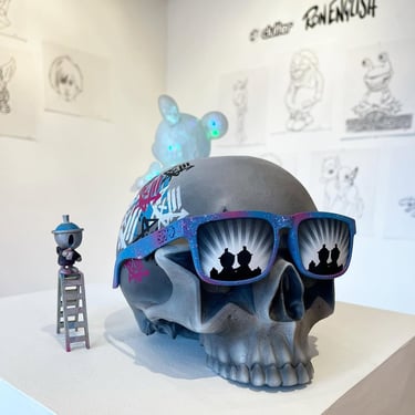
If the first RE-IMAGINE targeted classical icons like the Mona Lisa, this second aimed straight at the corporate heart: Mickey Mouse. The most sanitized, franchised, and monetized character in pop culture, here disassembled into grotesque vinyl.
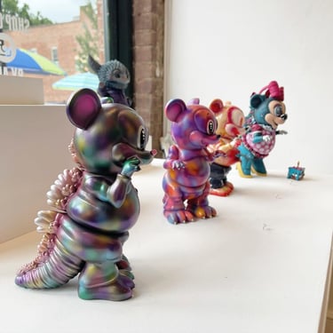
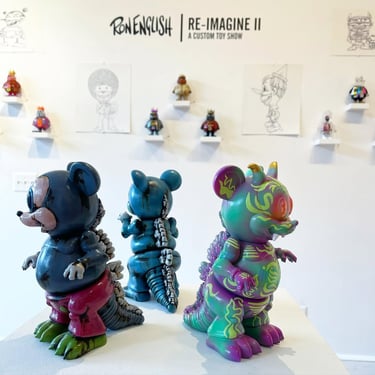
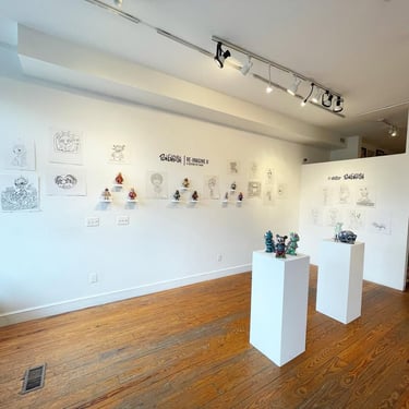
Over thirty artists joined in again, some returning from the first edition, others new to the lineup. Together they took the same base platform and bent it into dozens of alternate realities. Some playful, some unsettling, all mutations of a brand that once sold innocence.
Ron English’s own works anchored the show: original drawings and fresh customs alongside the community’s contributions. The Gallery floor became a battlefield where advertising mascots, childhood memories, and cultural critique clashed in vinyl form.
Clutter Gallery, with its hybrid model of controlled physical visits and strong online presence, once again turned limitations into fuel. Collectors lined up digitally and physically, proving that even under constraints, the hunger for ArT Toys, especially when they expose the mechanics of pop culture, only grows stronger.
Why It Mattered. What the exhibition shows
RE-IMAGINE II didn’t simply repeat the first. It escalated it.
The focus shifted from Art history to corporate mythology. From the Mona Lisa to Mickey. From cultural heritage to cultural monopoly. By corrupting the mouse, the Show aimed at the bloodstream of global branding, reminding us that behind every cute mascot there’s a machine of consumption.
And the choice of platform, a mouse body with a grin and a spine, turned the message into plastic flesh. These weren’t nostalgic collectibles. They were warnings. Evidence of what happens when symbols are stretched too far, consumed too long, left to rot under their own marketing weight.
The Exhibition showed that ArT Toys can be more than satire. They can be an antidote. A way of holding toxic icons in your hand, acknowledging their power, and reprogramming them into something else.
Legacy & Mutation
The legacy of RE-IMAGINE II lies in continuity. The first proved that icons could be rewritten. The second proved that rewriting can become ritual. A series. A pattern of mutation.
And the typo on the POSTER? Call it a glitch, or call it prophecy. The same date as the first show, as if to suggest these re-imaginings are not events locked in time but cycles. Each year, same calendar, new mutations.
Clutter Gallery has cemented its role as the stage where this ritual unfolds. From its birth as a magazine in the early 2000s to its physical gallery in Beacon since 2011, Clutter has always been more than a venue. It’s an amplifier of mutation, a space where customs turn from hobby into cultural critique.
RE-IMAGINE II confirmed what ArT Toy collectors already suspected: once You open the icon, you can’t close it again.
Biography in Brief
Ron English remains the prophet of Popaganda: decades spent twisting corporate mascots, street ads, and beloved symbols into something grotesque, funny, unforgettable. His smileys grin with skulls. His mascots grow obese. His saints melt into chemical spills.
Clutter Gallery remains his perfect accomplice. First as a magazine documenting the global rise of ArT Toys and lowbrow Art, then as a Gallery producing vinyl and staging custom Shows that double as manifestos. From Beacon, they’ve made mutation not just possible, but inevitable.
Together, they turned the sequel into proof: the Act of Re-Imagining is not a one-time rebellion. It is a permanent condition of culture.
Final Thought from Art Toy Gama
Our rule of thumb: make the familiar impossible to overlook.
RE-IMAGINE II sharpened that principle. A mouse so familiar it should fade into wallpaper was split open, given a grin, a spine, a sickness. Thirty voices then took that mutation and pushed it further, until Mickey was no longer a mascot but a battlefield.
That’s the charge of ArT Toys. They don’t prettify; they pressure-test. They let us hold the corruption of icons in our hands and decide what to do with it. They show us that branding is not untouchable, that myths can be melted and recast.
We don’t collect ArT Toys. We collect reprograms. RE-IMAGINE II left us with the clearest evidence yet: culture doesn’t survive by staying intact. It survives by being hacked, again and again, until the smile rots into something unforgettable.
👉 Keep following our chronicles here...
and explore the mutations alive today in our [Art Toy Gama Store].
Join The First and Only Art Toy Newsletter Society in the World here: https://emails.arttoygama.com/l/email-subscription
#1000IconicArTToyExhibitions
We’re currently building an Upcoming Publication that explores and celebrates
the most iconic and influential Art Toy exhibitions around the world.
Each article in this series helps document, reflect, and invite the community
to take part in constructing this cultural archive — one exhibition at a time.
We’ve seen countless exhibitions since then: small and large, modest and monumental.
And we love them all.
No matter where they take place or the resources behind them,
every ArT Toy show adds something to the Movement.
Some will make history, others will make Memory. All of them matter.
This is not just documentation.
This is Dis(Play) in the making.
And You’re part of it.
Art Toy Gama Legacy
#ArTToyGamaLegacy
Art Toys. Paintings. Fine Art Prints. Not what You expect.
Real collectors don't follow trends—they redefine them
We didn’t lose our inner child. We turned it into Art.
You collecting, or just hoarding what the algorithm spoon-feeds you?
contact
© 2025. All rights reserved.