We didn’t lose our inner child. We turned it into ArT Toys and More...with purpose.
🕯️ Medicom Toy Exhibition ’13: Lights down, neon up
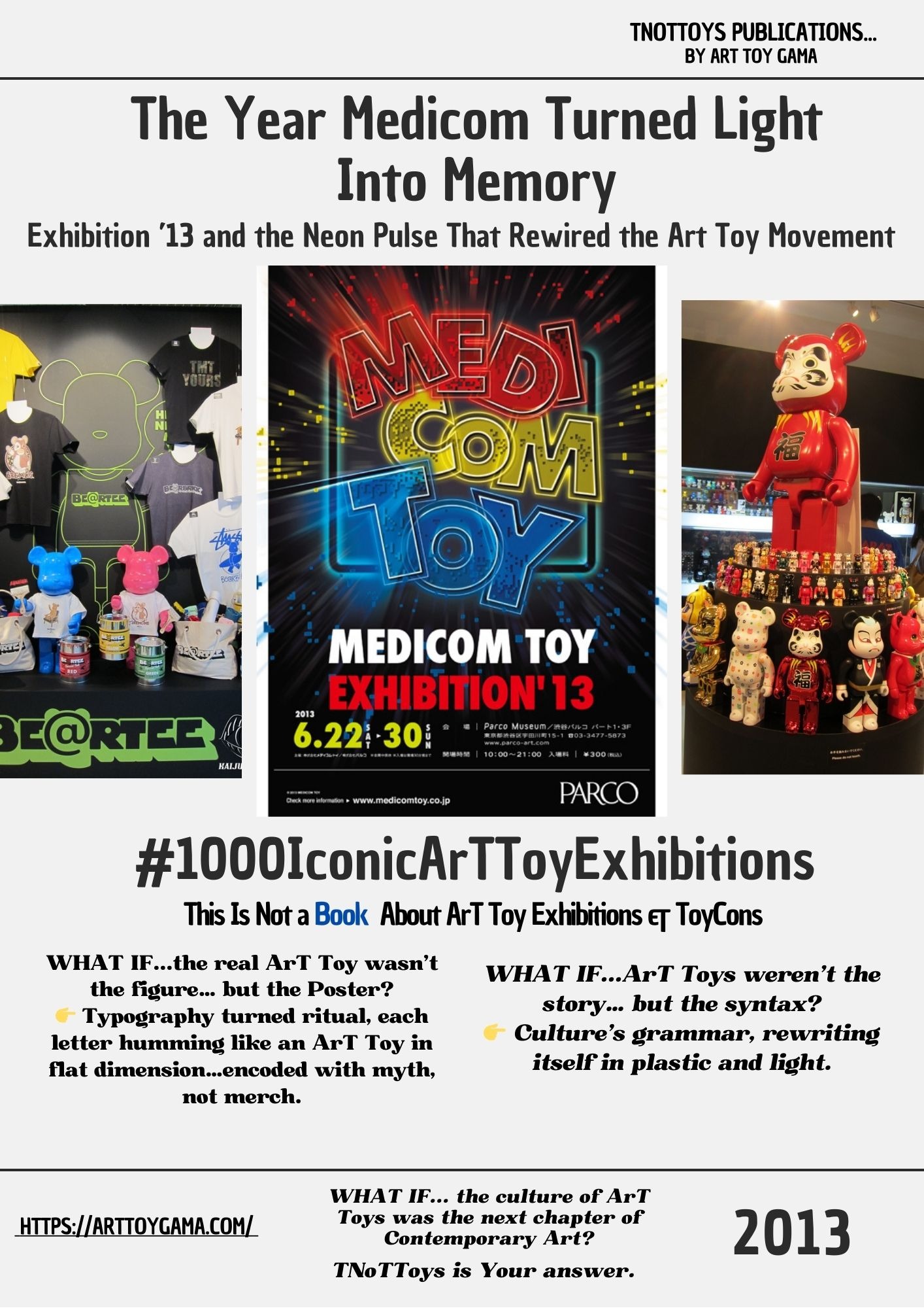
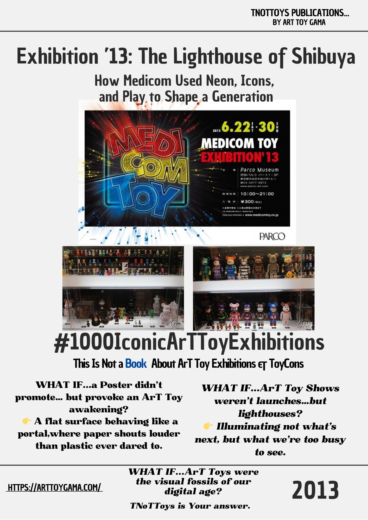
When a bright Logo Became a Lighthouse. Parco Museum, Shibuya:The Annual Ritual That Turned Medicom Toy Exhibition into Myth #00002 TNoTToys Publications
1000 ICONIC ART TOY EXHIBITIONSTNOTTOYS PUBLICATIONSTNOTTOYS
Sergio Pampliega Campo & Cristina A. del Chicca

🌀 This post is part of an ongoing research series from Art Toy Gama’s editorial division:
📚 This Is Not a Book About Art Toy Exhibitions & ToyCons
Our Upcoming Art Toy Book: 1000 Iconic ArTToy Exhibitions
Tokyo, June 2013.
Lights down, neon up.
Medicom Toy Exhibition ’13 didn’t simply launch products: it switched on a signal.
A neon flare in the middle of Shibuya, whispering to the world:
Toys are not the end of the Story; they’re the beginning of a Myth.
This was the 11th edition of a ritual Medicom had started in 2003. And by then, it was unmistakable: this wasn’t a manufacturer’s showroom. It was a museum of the now, where anime legends like Kamen Rider or Mazinger Z stood beside Be@rbricks wrapped in pop culture collaborations, and where the line between gallery and street collapsed into electricity.
Here, ArT Toys didn’t just reflect culture. They curated it.
Sofubi prototypes, 1000% Be@rbricks (including the now-iconic Karimoku collaboration), Kubrick figures, even paint samples: everything felt less like a product and more like a Memory device, a fragment of the collective imagination staged under light.
This wasn’t about what You could buy.
It was about what You were ready to remember.
🔍 Why It Mattered
Exhibition ’13 made one thing undeniable:
ArT Toys aren’t Trends. They’re cultural punctuation marks.
Signals telling us where to pause, where to resist, where to insist.
Every Medicom Toy Exhibition functions as:
Archive: capturing the present moment in pop and subculture.
Manifesto: declaring what toys can become.
Symbol: connecting collectors into a global ritual of belonging.
In 2013, Medicom didn’t just show Toys: it showed how ArT Toys could become totems:
icons that carried Identity, Memory, and Defiance.
As we affirm in our own Manifesto at Art Toy Gama:
ArT Toys are not made to decorate, but to carry Your Voice, Story, and Legacy.
🧬 Legacy & Mutation
From its collaborations with A Bathing Ape (like the limited BABY MILO Tee created especially for Exhibition ’13) to experiments like the Karimoku Be@rbrick 1000%, Medicom proved something vital: ArT Toys are not endpoints, they are interfaces.
Interfaces where industries collide, where memories overlap, where generations meet.
This is not merchandising.
This is Trojan Horse culture:
an object that looks like play but smuggles something deeper:
status, heritage, resistance.
Medicom Toy didn’t exhibit products. It staged a language.
A language where every drop is a ritual, every prototype a promise, every collaboration a way of hacking mainstream culture and turning it into cult.
And when we look back from today: with Medicom already written into history as one of the few brands in the Movement with three decades of continuity: Exhibition ’13 feels like an early lighthouse beam: proof that these annual gatherings were never about novelty alone.
They were about training us to see ArT Toys as living archives of Memory, Continuity, and Rebellion.
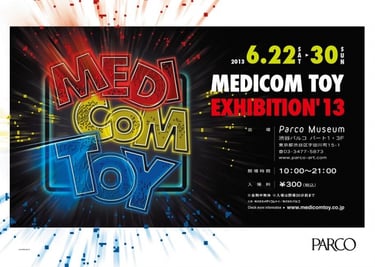
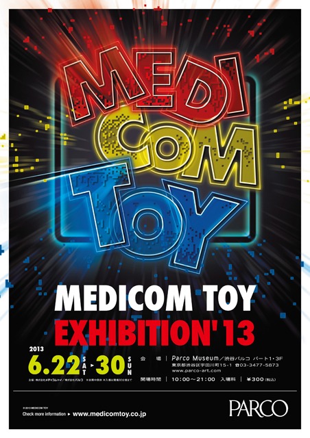
✧ POSTER Reading
The Neon That Refused to Sleep
The poster for Exhibition ’13 is not an announcement.
It’s a power surge.
A massive MEDICOM TOY logotype,
exploded into red, yellow, and blue neon:
three primary signals vibrating against a black cosmic void.
The typography behaves like architecture:
bold, blocky, confident, retro-futuristic.
Each letter glows with a different mood:
red = impact,
yellow = energy,
blue = circuitry,
together forming a triad of play, industry, and future.
Pixel particles scatter across the background
like data breaking apart...
a nod to arcade nostalgia,
8-bit memory,
and the digital childhoods of an entire generation.
The neon frame isn’t decoration.
It’s a threshold.
A portal inviting viewers not into a museum
but into a system:
the Medicom Operating System, where toy ≠ object but interface.
The POSTER says without speaking:
This is not a brand.
This is an environment.
A visual language glowing in the dark.
And the design choice is deliberate:
Medicom positions itself not as manufacturer,
but as signal tower.
A beacon.
A lighthouse.
A cultural voltage spike.
✧ Energy Behind The POSTER
The Pulse of a Movement in Electric Form
The POSTER radiates velocity.
It feels like something that shouldn’t stand still.
This is the emotional charge inside it:
Identity
The neon outlines behave like a signature.
Not a logo, but a presence.
The brand becomes a character in its own universe.
Memory
The arcade colors and pixel fragments tug at a past we all shared:
late nights, broken joysticks, CRT glow, Saturday anime.
A collective adolescence distilled into light.
Legacy
The poster announces an annual ritual.
It behaves like a festival banner,
broadcasting continuity, not novelty.
You don’t “visit” Exhibition ’13.
You return to it.
Rebellion
The composition refuses minimalism.
It rejects calm.
It throws light in your eyes.
It chooses spectacle over subtlety,
a refusal to shrink or behave.
Visually, it functions like a lighthouse:
not guiding ships,
but guiding collectors.
Emotionally, it behaves like the hum of a machine
that has been plugged into culture for a decade
and refuses to power down.
This POSTER is not about Medicom’s history.
It’s about Medicom’s voltage.
Its pulse.
Its refusal to sleep.
🎯 Final Thought from Art Toy Gama
At Art Toy Gama, we believe exhibitions like these prove a simple truth:
Collecting isn’t about Trends. It’s about continuity.
Medicom Toy Exhibition ’13 was not just a celebration of ArT Toys.
It was the confirmation that Medicom had turned product launches into cultural punctuation marks: moments that cut through time like commas, pauses, and exclamation points in the story of culture.
And in the long horizon of the Movement, toward anniversaries, toward decades, toward the next century, the question isn’t what ArT Toys will come next.
It’s: What futures will we dare to write through them?
Because these aren’t just Toys.
They are time machines in vinyl.
They are icons disguised as playthings, fragments of memory smuggled into the everyday.
They are stories that refuse to fade.
And this POSTER — bright, loud, impossible to ignore — reminds us of one thing:
Dis(Play) isn’t passive.
It’s a signal.
A declaration.
A way of saying to the world:
I see the future...and I’m not afraid to light it up.
🧠Still collecting what’s popular? Or are you ready to collect what matters?
👉 Step into the Movement that makes memory visible.
🎯 Explore the Art Toy Gama Store : where neon becomes narrative, and objects become You.
Join The First and Only Art Toy Newsletter Society in the World here: https://emails.arttoygama.com/l/email-subscription
#1000IconicArTToyExhibitions
We’re currently building an Upcoming Publication that explores and celebrates
the most iconic and influential Art Toy exhibitions around the world.
Each article in this series helps document, reflect, and invite the community
to take part in constructing this cultural archive — one exhibition at a time.
We’ve seen countless exhibitions since then: small and large, modest and monumental.
And we love them all.
No matter where they take place or the resources behind them,
every ArT Toy show adds something to the Movement.
Some will make history, others will make Memory. All of them matter.
This is not just documentation.
This is Dis(Play) in the making.
And You’re part of it.
Art Toy Gama Legacy
#ArTToyGamaLegacy
Art Toys. Paintings. Fine Art Prints. Not what You expect.
Real collectors don't follow trends—they redefine them
We didn’t lose our inner child. We turned it into Art.
You collecting, or just hoarding what the algorithm spoon-feeds you?
contact
© 2025. All rights reserved.