We didn’t lose our inner child. We turned it into ArT Toys and More...with purpose.
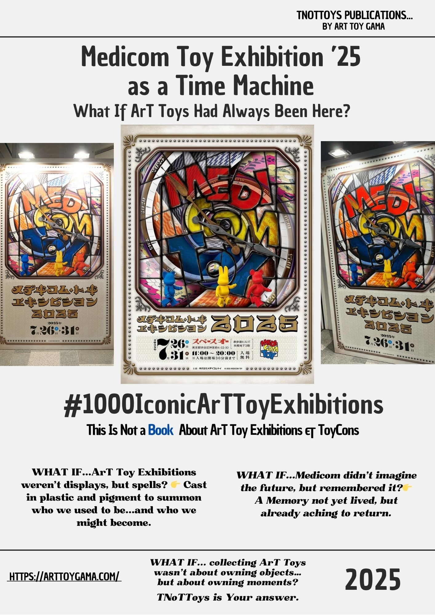
🕯️ Medicom Toy Exhibition ’25 as a Time Machine
What If ArT Toys Had Always Been Here? Medicom Toy Exhibition: a Ritual of Imagination, and the Countdown to 30th Anniversary #00018 -TNoTToys Publications
1000 ICONIC ART TOY EXHIBITIONSTNOTTOYS PUBLICATIONSTNOTTOYS
Sergio Pampliega Campo & Cristina A. del Chicca

🌀 This post is part of an ongoing research series from Art Toy Gama’s editorial division:
📚 This Is Not a Book About Art Toy Exhibitions & ToyCons
What if ArT Toys had been with us for a hundred years?
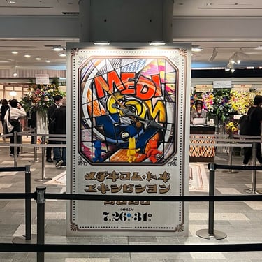
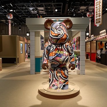
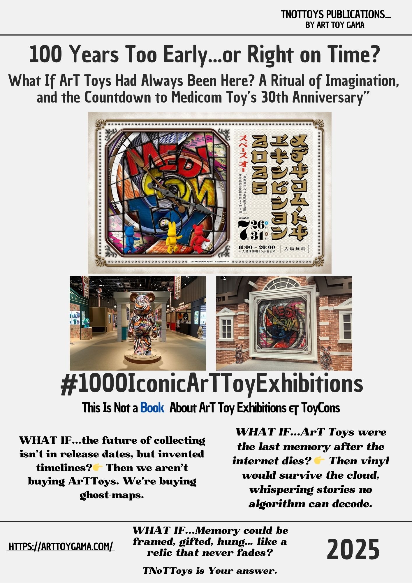
That was the question pulsing through Medicom Toy Exhibition ’25, held this last summer at Omotesando Hills in Tokyo.
But this wasn’t nostalgia.
This was time travel staged as design.
A speculative detour into a parallel past, where Be@rbricks and sofubi already haunted the gaslit streets of the Taisho era.
The exhibition didn’t feel like a showroom.
It felt like a myth made physical.
Like stepping into a dream where stained glass logos, colossal Toys, and symbols of play weren’t products, but portals.
This year’s theme—“What if Medicom Toy had existed 100 years ago?”—wasn’t just clever branding.
It was a reminder that ArT Toys are emotional technologies: artifacts we use to remember, to speculate, to carry fragments of identity across eras.
And perhaps that’s why this exhibition mattered.
Because it wasn’t about unveiling 900 objects; it was about unveiling a way of seeing.
A ritual that Medicom has practiced every year since 2003: taking what might look like a product launch and mutating it into a cultural punctuation mark.
And as the brand now approaches its 30th anniversary in 2026, Exhibition ’25 stands as both a prelude and a promise: that what we collect isn’t plastic, but continuity.
🧬 Legacy & Mutation
For nearly three decades, Medicom Toy has blurred the borders between commerce and culture, object and myth.
Its exhibitions have always been more than showcases; they are annual rituals of mutation, archives of a Movement that refuses to stand still.
What made this year remarkable was its historical twist:
By staging the event as if Medicom had existed a century earlier, the company reminded us that ArT Toys are not bound by time.
They are Memory devices.
They are speculative machines.
They are mirrors that look forward as much as they look back.
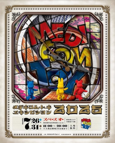
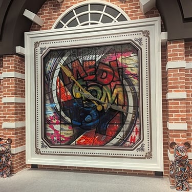
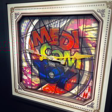
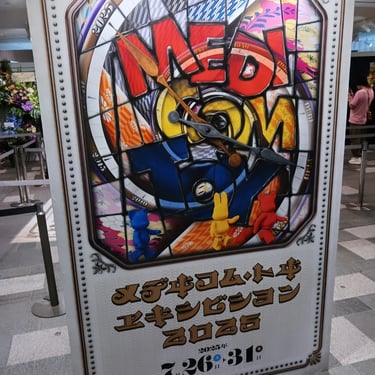
🎨 The POSTER as a Portal
Look closely.
This isn’t a POSTER.
It’s a time machine disguised as stained glass.
The visual identity for Medicom Toy Exhibition ’25 doesn’t scream for attention: it summons. A fractured clock face, with its hands running backwards, reminds us that the theme was not an aesthetic trick, but a conceptual axis.
The typography—ornamental, almost ecclesiastical—frames the event like a sacred announcement. The gold letters don’t read as text; they read as architecture, like the engraving of an old manuscript reborn for pop culture.
At the bottom of the stained glass, three colored figures (red, yellow, blue) stand as if pilgrims before an altar. They’re not just mascots. They’re avatars of us, the audience; waiting, watching, aware that entering the exhibition means stepping into a parallel timeline.
This design doesn’t promote. It prophesies.
It isn’t decoration. It’s a totem…a visual spell reminding us that exhibitions are not shows, but thresholds.
✧ Extended POSTER Reading:
The Stained-Glass Time Machine Medicom Built
Look again.
This is not a promotional POSTER.
It is an altar-piece.
A clock-face cut into myth, rendered in stained glass that behaves like both memory and prophecy.
The POSTER frames Medicom Toy Exhibition ’25 not as an event, but as a ritual of temporal distortion.
1. Stained Glass as Cultural Technology
Stained glass belongs to churches, cathedrals, sacred architecture.
Medicom hijacks that vocabulary.
The panes fracture into patterns taken from 100 years of visual culture: textile motifs, toy silhouettes, pop iconography, timelines disguised as ornament.
Every shard looks like a piece of a century that Medicom is pretending to have lived through.
This isn’t decoration.
This is historiography by illusion.
A fake past presented with the seriousness of heritage.
2. The Clock That Runs Backwards
At the center: a set of clock hands, heavy, metallic, pointing in contradictory directions.
Time is not ticking.
Time is looping.
Time is folding back onto itself.
Medicom asks:
“What if the future we inhabit was built in 1925?”
And then gives you an answer in the form of a broken, untrustworthy clock.
The POSTER does not measure time.
It manipulates it.
3. Three Figures as Pilgrims
Red. Yellow. Blue.
Not mascots; witnesses.
Their backs are turned to us.
All three walk toward the stained-glass clock, as if entering a cathedral of pop mythology.
They behave the way humans behave before sacred relics:
small, reverent, curious.
This is the most important narrative gesture of the POSTER:
The audience does not watch the exhibition.
The audience enters it.
4. Typography as Temporal Fiction
The Japanese lettering uses a hybrid style: part 1920s Art Deco, part retro-fantasy, part digital revival.
It feels both old and invented.
Medicom builds an alphabet that has never existed,
but could have existed,
in that parallel century the exhibition imagines.
This is typography as world-building.
5. The Frame as Museum Artifact
The outer border mimics an aged, ornate frame: tiny dots, engravings, metallic corners.
It looks like something taken from a national museum.
But, again, it is a lie.
A newly printed artifact pretending to have survived a century.
The POSTER becomes a prop from a history that never happened, and therefore a statement:
ArT Toys are not young.
They are timeless because they refuse to anchor themselves in real timelines.
✧ Hidden Historical Layers:
Taishō Echoes, Design Codes & Local Script
1. From Factory to Cathedral: Materiality of Memory
By wrapping its world in stained glass,
Medicom performs a quiet transformation:
from factory floor
to cathedral window.
Stained glass has always been a technology of belief.
Light passes through,
image remains.
It’s a medium built for saints, coats of arms, royal emblems.
Medicom borrows that language
and gives it to Be@rbricks and sofubi.
The message is simple and radical:
These Toys are not side-products of culture.
They are culture.
They deserve the same seriousness
as icons, crests, relics.
And the way stained glass is built matters.
Fragments of colour,
cut apart,
held together by black lines of lead.
Exactly like the Art Toy ecosystem:
postwar plastics, Godzilla sofubi, licensed figures,
Hong Kong urban vinyl, Action Man customs, artist editions,
pieces from different decades,
different scenes,
soldered together by one thing:
collecting.
The cracks in the glass are temporal breaks.
The lead that joins them
is the continuity of the Movement.
2. Taishō Time and the Birth of Modern Pop
“What if Medicom Toy had existed 100 years ago?”
puts us around 1925.
That means one word in Japanese history:
Taishō (大正).
A brief era (1912–1926)
where Japan accelerated into modernity:
westernised fashion,
department stores and cafés,
early cinema,
graphic design,
magazines on every corner.
By choosing that date,
the POSTER quietly claims:
“If we had been here then,
we would have been part of that first wave of mass culture.”
The stained-glass aesthetics,
half Art Nouveau, half early Art Deco,
mirror the European styles that entered Japan in Taishō years.
Medicom rewrites its origin story:
not just a vinyl company founded in 1996,
but an imaginary design house
that could have mediated Japan’s relationship to Western modernity
from the start.
The POSTER becomes a visual what if:
What if sofubi, character design and crossovers
had been part of Japan’s first encounter with consumer modernity,
not something that arrived decades later?
This invented past doesn’t erase the real history of ArT Toys;
it adds a mythical layer on top.
A “ghost origin” that places the Movement closer to modern art and design
than to simple merchandising.
3. Primary Colours as Design Ancestry
Red, yellow, blue…
those three small figures at the bottom,
are not random mascots.
They are the colours of design revolution:
Bauhaus in Germany,
De Stijl in the Netherlands,
early modern graphics
from roughly the same years as Taishō.
Those movements hunted for essence:
pure form,
primary colour,
fundamental structure.
Medicom quietly plugs ArT Toys into that genealogy.
Not as “cute merch”,
but as part of the same project:
rebuilding the world
through simple shapes and strong colour.
The three rabbits are stripped of logos, clothes, brands.
Just minimal vinyl silhouettes.
They stand as the pure form of the ArT Toy:
a blank avatar any story can inhabit…
Batman, Star Wars, an old anime,
a Taishō-era pattern,
or your own Memory.
They also act as the universal collector:
any gender, any age, any country,
reduced to one simple shape
walking toward the altar of play.
4. Japanese Script as Local Anchor
Beneath the glass, the Japanese text does the practical work:
メディコム・トイ エキシビジョン ’25
(Medicom Toy Exhibition ’25)
会期 (kaiki) — Exhibition period
会場 (kaijō) — Venue
表参道ヒルズ (Omotesandō Hills),
the exact building where all this is happening.
Sometimes you’ll also see the core question written in Japanese:
「もしもメディコム・トイが100年前に存在したら」
(Moshimo Medicom Toy ga hyakunen mae ni sonzai shitara)
“What if Medicom Toy had existed 100 years ago?”
Functionally, this is logistics.
Symbolically, it’s an anchor.
While the stained glass pretends to be Europe circa 1925,
the kanji and kana pull the myth back down:
This is Tokyo.
This is Omotesandō.
This is summer 2025.
This is real.
Global aesthetics above,
local script below.
Exactly how the ArT Toy Movement works:
a constant dialogue between worldwide pop
and rooted culture.
The POSTER tells You:
ArT Toys travel through imaginary centuries,
but they always land somewhere specific,
a city,
a street,
a language,
a collector’s shelf.
✧ Energy Behind the POSTER .
The Emotional Voltage Driving Exhibition ’25
What does the POSTER make you feel?
Medicom doesn’t aim for hype.
It aims for reverence.
Not excitement.
Recognition.
1. Atmosphere: Sacred Absurdity
The stained glass glows like a cathedral window,
but the subjects are cartoon rabbits.
This tension, sacred form + absurd content, is the emotional engine of the POSTER .
It creates a mood that is neither ironic nor solemn, but something in between:
devotional play.
2. Identity: ArT Toys as Myth-Making Tools
The three figures serve as avatars of the viewer.
They tell You:
“You are part of this timeline.
You are part of this fiction.
You are part of this memory we’re inventing.”
The POSTER turns collectors into protagonists.
3. Nostalgia: Not Backwards, But Sideways
This is not nostalgia for the past.
This is nostalgia for a past we never had.
A longing for a world where ArT Toys already existed in 1925.
A longing for a parallel history where Toys were always cultural architecture, not consumer goods.
This is a new category of memory:
speculative nostalgia.
4. Rebellion: Against Linear Time
Traditional gallery Posters communicate:
“This show starts here.
It ends there.”
Medicom’s POSTER refuses that logic.
It says:
“Time is not the container of ArT Toys.
ArT Toys are the container of time.”
This is rebellion not through aesthetics, but through temporal disobedience.
5. Legacy: The Countdown to 30 Years
The emotional subtext is clear:
This POSTER is pre-anniversary liturgy.
A warm-up ritual.
A ceremonial drum roll.
It tells You that Medicom’s next evolution will not be a product.
It will be a timeline.
🎯 Final Thought from Art Toy Gama
At Art Toy Gama, we believe exhibitions like these prove a simple truth:
Collecting isn’t about trends. It’s about continuity.
Medicom Toy Exhibition ’25 was not just a celebration of ArT Toys.
It was the confirmation that Medicom has turned product launches into cultural punctuation marks.
Because in our Manifiesto, we say it clearly:
ArT Toys are not ornaments. They are weapons of Memory.
They don’t exist to decorate shelves. They exist to unsettle, to remind, to persist.
They are fragments of identity materialized, totems that speak the language of what you refuse to forget.
And now, as the brand approaches its 30th anniversary, the question isn’t just what ArT Toys will come next.
It’s: What futures will we write together through them?
Because these aren’t just Toys.
They are Absurd made sacred, proof that what doesn’t fit in the mainstream is precisely what defines us.
They’re time machines in vinyl and resin.
They are Stories that refuse to fade.
And, above all, they are the evidence that in every collector, in every artist, in every exhibition, beats the same truth:
We don’t collect objects. We collect who we are willing to remember.
Still chasing the latest release? Or ready to collect the pieces that make history?
👉 Step into the Art Toy Gama Store —
where every piece is not just an object, but a fragment of continuity.
Join The First and Only Art Toy Newsletter Society in the World here: https://emails.arttoygama.com/l/email-subscription
#1000IconicArTToyExhibitions
We’re currently building an Upcoming Publication that explores and celebrates
the most iconic and influential Art Toy exhibitions around the world.
Each article in this series helps document, reflect, and invite the community
to take part in constructing this cultural archive — one exhibition at a time.
We’ve seen countless exhibitions since then: small and large, modest and monumental.
And we love them all.
No matter where they take place or the resources behind them,
every ArT Toy show adds something to the Movement.
Some will make history, others will make Memory. All of them matter.
This is not just documentation.
This is Dis(Play) in the making.
And You’re part of it.
Art Toy Gama Legacy
#ArTToyGamaLegacy
Art Toys. Paintings. Fine Art Prints. Not what You expect.
Real collectors don't follow trends—they redefine them
We didn’t lose our inner child. We turned it into Art.
You collecting, or just hoarding what the algorithm spoon-feeds you?
contact
© 2025. All rights reserved.